Top Photography Editing Styles That Attract Viral Engagement
In the hyper-competitive visual landscape of social media, a stunning photograph is only half the battle. The edit is what transforms a great shot into a viral sensation. It’s the visual voice that cuts through the noise, evokes immediate emotion, and compels users to stop scrolling, like, share, and comment. Understanding and mastering the editing styles that resonate with algorithms and human psychology is no longer a creative luxury—it's a core component of a modern digital growth strategy. This definitive guide delves into the most powerful photography editing styles proven to generate explosive engagement, dissecting the technical workflows, psychological triggers, and platform-specific nuances that separate trending posts from the forgotten.
The Psychology of a Viral Edit: Why Certain Styles Capture Mass Attention
Before we deconstruct the specific styles, it's crucial to understand the "why" behind their success. A viral edit isn't just about aesthetics; it's a calculated application of visual principles that tap into deep-seated human psychology. These edits create a momentary cognitive spark that interrupts the passive scrolling state and forces engagement.
The Dopamine-Driven Color Palette
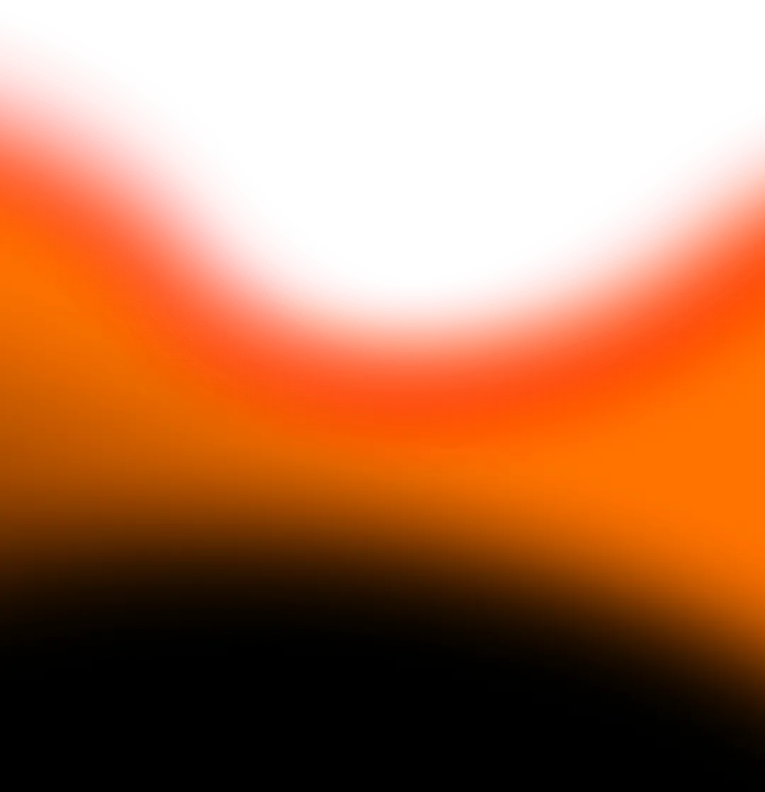
Color is the most immediate emotional trigger in a photograph. Viral edits often leverage high-impact, saturated colors—particularly warm tones like vibrant oranges, deep magentas, and rich cyans. These hues are associated with energy, excitement, and positivity, triggering a small release of dopamine in the viewer's brain. This creates a subconscious association between the positive feeling and your content, making them more likely to engage and seek out similar visuals in the future. This principle is why AI sentiment-driven editing is becoming a powerful tool, as it can automatically adjust color grades to evoke specific emotional responses.
The Allure of Nostalgia and Authenticity
In a digitally saturated world, audiences crave authenticity and tangible connection. This is the driving force behind the enduring popularity of vintage and filmic edits. Styles that mimic the imperfections of analog photography—such as light leaks, film grain, and subtle color shifts—trigger nostalgia. Nostalgia is a powerfully social emotion; it fosters a sense of shared experience and "the good old days," encouraging viewers to comment with personal stories and tag friends. This humanizing effect is a potent counterbalance to overly polished, corporate-looking content.
"The most viral edits aren't just seen; they're felt. They weaponize color and texture to bypass analytical thinking and connect directly with the viewer's emotional core."
Creating Dimension and "Scroll-Stop" Contrast
The average social media user scrolls through hundreds of feet of content daily. To stop this relentless motion, an image needs instant dimensional pop. Editing styles that master light and shadow—such as deep blacks, bright highlights, and clear subject separation—create a sense of depth that makes a 2D image feel almost tactile. This high dynamic range (HDR) effect, when done tastefully, makes the subject leap off the screen, fulfilling the viewer's subconscious desire for clarity and definition amidst a blur of content.
Furthermore, the strategic use of cinematic framing and editing techniques, often honed in video, is now crossing over into still photography. These principles guide the viewer's eye and create a narrative feel, making a single photo tell a story.
- Color Psychology: Using warm, saturated tones to stimulate excitement and positivity.
- Nostalgic Triggers: Leveraging film grain and light leaks to evoke shared memories and authenticity.
- Dynamic Range: Employing contrast and clarity to create depth and ensure visual priority in a crowded feed.
1. The Cinematic Color Grade: Crafting a Blockbuster Feel
The cinematic edit is the undisputed king of viral engagement, transforming everyday scenes into frames from a compelling movie. It’s not a single filter but a comprehensive approach to color and contrast that implies a story, mood, and production value. This style works across genres, from travel and lifestyle to portraiture and even food photography, because it promises an experience, not just an image.
Deconstructing the Cinematic Look
At its core, the cinematic style is defined by three key characteristics:
- The Teal and Orange Color Theory: This is the most recognizable trait. By pushing shadows and cooler mid-tones towards teal/blue and warming up skin tones and highlights with orange, you create a visually pleasing color contrast that makes subjects pop. This theory is prevalent in Hollywood because it naturally separates human subjects from their environments.
- S-Curve Contrast: Instead of a linear contrast adjustment, cinematic edits use a gentle 'S' curve in the tone curve panel. This crushes the blackest blacks slightly, lifts the whitest whites, and creates a rich, mid-tone contrast that feels deep and professional without looking overly HDR.
- Soft Highlight Roll-Off: Cinematic images avoid harsh, clipped highlights. The light transitions smoothly from bright to white, a quality often achieved by subtly lowering the highlight slider and using texture/clarity adjustments to retain detail.
Step-by-Step Editing Workflow
Here’s a practical workflow to achieve this look in Adobe Lightroom Classic or similar applications:
Step 1: Base Exposure & S-Curve. Start with a well-exposed raw file. Navigate to the Tone Curve panel and create a slight S-shape. Pull the bottom-left anchor point slightly upwards to lift the blacks and reduce harshness.
Step 2: Color Grading in HSL. Go to the Hue/Saturation/Luminance panel.
- Oranges/Yellows: Adjust the Hue of Oranges towards a richer, more amber tone. Slightly increase Saturation and Luminance to make skin tones glow.
- Blues/Aquas: Shift the Hue of Blues towards Teal. You can moderately increase Saturation but often decrease Luminance to give shadows more depth.
Step 3: The Power of Calibration. The Camera Calibration panel in Lightroom is a secret weapon. Gently shift the Blue Primary Hue towards the left (towards Teal). This applies a foundational cinematic tint across the entire image in a very natural way.
Step 4: Add Texture. Add a subtle amount of Film Grain (around 15-25, size 25-30, roughness 50) in the Effects panel to digitally recreate the organic texture of film, further enhancing the cinematic feel. This aligns with the principles of AI-powered filmic texture addition that modern tools are now automating.
This style is incredibly effective for creating immersive luxury property videos and breathtaking drone adventure reels, where evoking a sense of awe and narrative is key.
2. The Moody Dark & Moody Aesthetic: Mastering Shadows and Emotion
Where the cinematic style is often bright and epic, the Dark & Moody aesthetic draws its power from intimacy, mystery, and raw emotion. It’s a style that embraces shadows, desaturated colors, and a low-key lighting approach. This aesthetic fosters a sense of depth and sophistication that encourages viewers to lean in and explore the image, resulting in higher dwell times and a more dedicated, niche audience.
The Emotional Resonance of Low-Key Imagery
This style resonates because it feels authentic and unvarnished. It doesn’t shy away from darkness, both literally and metaphorically, which can feel more honest and artistically credible than perpetually sunny, over-saturated content. It’s perfect for genres like portrait photography, moody landscapes, urban exploration, and introspective lifestyle content.
"Moody photography isn't about a lack of light; it's about the strategic placement of light. You're not taking away light, you're giving the shadows a purpose and a voice in the composition."
Crafting the Moody Edit: A Technical Deep Dive
The goal is to reduce the overall luminance while guiding the viewer's eye through selective contrast.
- Exposure and Tone Mapping: Start by reducing the overall Exposure slider. Then, significantly lift the Shadows and Blacks sliders to recover detail in the dark areas without making the image look flat. This creates a low-contrast, hazy base.
- Re-introducing Contrast Selectively: Use the Dehaze tool (+10 to +20) and a slight negative value on the Texture slider (-5 to -10) to add punch back into the mid-tones while maintaining a soft, ethereal quality. This is a critical step to avoid a muddy look.
- Color Desaturation and Shifting: In the HSL panel, reduce the Saturation of almost all colors, particularly Greens, Yellows, and Blues. Then, use the Color Grading panel (or Split Toning) to add a subtle cool tone (like a slate blue or grey) to the Shadows and a very weak warm tone (a soft cream) to the Highlights. This creates a complex, cohesive color palette.
- Vignette: Add a strong, subtle Vignette to further darken the edges and pull the viewer's eye towards the subject.
The technical precision required for this style is now being augmented by AI predictive editing tools that can analyze a scene and suggest optimal shadow recovery and color grading to achieve a specific mood. This style shares a kinship with the emotional depth sought in powerful AI-generated music videos.
3. The Bright & Airy Lifestyle Edit: The Algorithm's Favorite
If the Moody aesthetic is for night, the Bright & Airy edit is for a perpetual, perfect morning. Characterized by overexposed highlights, clean whites, soft pastel colors, and a minimalistic feel, this style is a perennial favorite on platforms like Instagram and Pinterest. It embodies aspiration, cleanliness, and a serene, curated life, making it incredibly effective for influencers, lifestyle brands, wedding photographers, and food bloggers.
Why "Light" Equals "Like"
From a psychological standpoint, bright images are processed more easily by the human brain. They are associated with positive concepts like happiness, purity, and simplicity. This low-cognitive-load experience is pleasing to the viewer, making them more likely to engage. Furthermore, bright images tend to look cleaner and more professional on the small screen, standing out clearly against the often dark-mode interfaces of modern apps.
Achieving the Flawless Bright and Airy Look
The key here is to master the art of overexposure without blowing out critical details.
- Lift the Exposure & Highlights: Start by increasing the Exposure globally. Then, dramatically lift the Whites and Highlights sliders. Don't be afraid to let some non-essential background elements, like skies or windows, blow out completely—this contributes to the style.
- Open Up the Shadows: Maximize the Shadows and Blacks sliders to eliminate any harsh, distracting shadows. The goal is an even, flat light across the entire image.
- Color Palette Management: Reduce the Saturation of vibrant colors like Reds and Greens. Shift the Hue of Blues towards a lighter aqua and Yellows towards a warmer, softer cream. The overall color palette should feel muted and harmonious, not punchy.
- Clarity and Texture: Often, a slight reduction in Clarity (-5 to -10) and a subtle increase in Sharpening (+25 to +40 with a high Masking value) can enhance the soft, dreamy quality while keeping the main subject defined.
This style is a cornerstone for content that thrives on aspiration, such as destination wedding cinematics and successful lifestyle vlogs. The technical process of achieving this look at scale is being revolutionized by automated AI editing pipelines that can batch-process hundreds of images to a consistent bright and airy standard.
4. Vintage & Film Simulation: The Authenticity Engine
In an age of perfect digital reproduction, the deliberate imperfection of vintage and film simulation edits has become a powerful tool for virality. This style isn't about simply applying a sepia filter; it's about meticulously recreating the chemical and physical characteristics of analog film stocks. This approach generates engagement by tapping into powerful drivers of nostalgia, authenticity, and tangible texture.
The Nostalgia Factor and Tactile Appeal
Film edits evoke a sense of history and timelessness. They make a moment feel both precious and authentic, as if it were pulled from a family album or a classic magazine. The presence of grain, light leaks, and color shifts tells the viewer that this image has a "soul," a physicality that clean digital files often lack. This tactile appeal encourages a deeper emotional connection, making viewers more likely to share content that feels "real."
Recreating Classic Film Stocks Digitally
To move beyond basic filters, focus on emulating specific, beloved film stocks. Here’s how to approach a classic Kodak Portra look, renowned for its warm skin tones and gentle contrast:
- Base Tone Curve: Create a soft, flattering S-curve, but lift the black point significantly to give it that "milky" shadow quality characteristic of color negative film.
- HSL Adjustments for Skin: In the HSL panel, shift Red Hue slightly towards orange and Yellow Hue slightly towards red. This creates the foundational warm, peachy skin tone. Increase the Luminance of Oranges and Yellows to make skin glow.
- Green and Blue Handling: Shift Green Hue towards a more yellow-olive tone and reduce its Saturation. Shift Blue Hue towards a more cyan-teal and slightly desaturate it. This replicates Portra's distinctive color palette for nature and skies.
- The Grain: This is non-negotiable. Use the Grain tool to add a fine, ISO-appropriate texture. A good starting point is Amount 20, Size 25, Roughness 50. The grain should be visible upon close inspection but not distracting.
For a more dramatic, cross-processed look reminiscent of viral festival content, you can push colors further, adding strong green or magenta tints in the Shadows via the Color Grading panel. The pursuit of perfect filmic quality is a driving force behind AI cinematic enhancement tools that can analyze and apply the color science of specific film stocks to digital footage.
5. The High-Contrast Monochrome: Timeless Drama in Black and White
Stripping an image of color forces the viewer to focus on the fundamental building blocks of photography: light, shadow, texture, shape, and emotion. A powerful high-contrast black and white edit can be more impactful than any color image in your feed. It conveys drama, intensity, and a timeless elegance that is both sophisticated and raw. This style is exceptionally effective for street photography, dramatic portraits, architectural shots, and conveying a sense of gravitas.
The Power of Simplification
By removing the distraction of color, a monochrome edit simplifies the composition and amplifies the emotional core of the image. It highlights textures—the wrinkles on a face, the roughness of a wall, the smoothness of water—in a way color cannot. This simplification creates a bold, graphic quality that is inherently "scroll-stopping" due to its stark difference from the colorful feed.
"Black and white photography is a visual reduction to the essential. It's not about what you take away, but what you choose to emphasize: form, light, and the raw moment itself."
Crafting a Dynamic B&W Image, Not a Flat One
The mistake many make is simply desaturating an image. A viral-worthy monochrome edit is built through careful channel mixing and local adjustments.
- Convert with Intent: Use the B&W Mix panel (or Channel Mixer in Photoshop). Don't just accept the default conversion. Slide the individual color channels to control how each color in the original image translates to a shade of grey. For example, darkening the Blue channel will dramatically darken a sky, while lightening the Orange and Yellow channels will brighten skin tones.
- Punchy Contrast Curve: Create a strong, classic S-curve in the Tone Curve panel. Don't be afraid to crush the blacks slightly and push the whites to create a sharp, dynamic range. This is where the "high-contrast" definition comes from.
- Texture and Clarity: A moderate increase in Texture and Clarity (+15 to +25) can enhance the gritty, tangible feel of the image, making every detail pop.
- Toning (Optional): For a classic, timeless feel, add a very subtle split tone. A cool blue in the shadows and a warm cream in the highlights, both at a very low saturation (under 5), can add immense depth and sophistication.
This style's focus on raw, unfiltered emotion makes it a perfect companion to the authenticity seen in behind-the-scenes bloopers that humanize brands. The technical process of optimizing contrast is also a key area for AI-driven smart lighting analysis in pre-production.
6. The Surreal & Digital Art Edit: Pushing the Boundaries of Reality
At the far end of the editing spectrum lies the Surreal & Digital Art edit. This style abandons the goal of realistic representation in favor of creating impossible, dreamlike, or hyper-stylized worlds. It is the ultimate tool for generating "how did they do that?" comments and shares, as it showcases immense skill and creativity. This style thrives on platforms like Instagram and TikTok, where visual novelty is heavily rewarded by the algorithm.
The "Wow" Factor and Shareability
Surreal edits break the viewer's expectations of reality. This cognitive surprise is a powerful trigger for engagement. When a user sees a photograph of a person floating in a galaxy of books or a cityscape melting into a waterfall, their brain pauses to process the impossible. This moment of awe is what leads to saves, shares, and follows, as users want to show others this unique piece of content and potentially learn the technique themselves.
Tools and Techniques for Surrealism
Creating these edits often moves beyond basic photo editors into compositing powerhouses like Adobe Photoshop, alongside a growing suite of AI-powered tools.
- Compositing is Key: The foundation of surrealism is blending multiple images seamlessly. This requires mastering layers, masks, and blending modes. Attention to detail is critical—matching lighting, perspective, and color temperature between all elements is what swhat separates an amateur composite from a professional one. Tools like Adobe's advanced masking features are essential for clean extractions.
- Color and Light Unification: Once elements are composited, you must unify the entire scene. Use adjustment layers like Curves, Color Balance, and Selective Color to match the color cast and contrast of every element. Dodging and burning is then used to repaint the light, ensuring all light sources logically interact with every object in the new reality you've created.
- Leveraging AI Tools: Modern surrealism is being supercharged by AI. Tools like generative fill can extend backgrounds or create entirely new elements from text prompts, while AI scene auto-completion tools are revolutionizing this workflow. Furthermore, AI-powered real-time CGI editors allow for the integration of 3D models with realistic lighting into photographic scenes, pushing the boundaries of what's possible.
This style is a direct relative of the creativity seen in viral AI music mashup videos and the immersive worlds built for breakthrough VR fitness content. The "impossible" nature of the edit is its greatest asset, making it a guaranteed method to stand out and generate massive engagement from an audience craving novelty.7. The HDR & Ultra-Vibrant Edit: Walking the Fine LineOften maligned yet perennially popular, the HDR (High Dynamic Range) and Ultra-Vibrant edit is a style that pushes saturation, clarity, and dynamic range to their absolute limits. When executed with subtlety and skill, it can create breathtaking, hyper-realistic images that pop with an almost three-dimensional quality. When overdone, it veers into the infamous "cartoonish" look. Understanding how to harness its power without crossing that line is key to using this potent, engagement-driving style.The Science of Visual Pop and LusterThis style works because it maximizes the visual information delivered to the viewer's eye. By combining multiple exposures or using sophisticated single-image tone mapping, you can reveal detail in both the deepest shadows and the brightest highlights that the human eye could not perceive in a single glance. This creates a sense of hyper-reality that is visually fascinating. The heightened saturation taps into the same dopamine-driven color psychology as the cinematic style, but turns the volume up, creating images that are inherently eye-catching in a thumbnail view. "The goal of good HDR is to show the world not as your camera sees it, but as your memory remembers it—more vivid, more detailed, and more intense."A Modern, Tasteful HDR WorkflowThe key is to avoid the "halo" effects and plastic-looking textures of old-school HDR. Here's a modern approach, best applied to landscape and architectural photography: - Bracketing and Merging: For the best results, capture a bracket of 3, 5, or even 7 exposures. Use software like Adobe Lightroom or Aurora HDR to merge them into a 32-bit DNG file. This gives you a massive amount of data to work with.
- Tone Mapping with Restraint: In the merged file, your initial sliders will have extreme ranges. The goal is balance.
- Set Exposure for the overall brightness.
- Pull Highlights down to -100 to recover cloud and sky detail.
- Push Shadows up to +100 to reveal foreground detail.
- Then, crucially, use the Whites and Blacks sliders to re-establish a natural contrast base. Pull Blacks down to reintroduce depth and push Whites to add sparkle.
- The Texture/Clarity/Dehaze Trifecta: This is where you walk the fine line.
- Texture: Increase (+20 to +30) to enhance mid-tone detail like rocks and foliage without affecting global contrast.
- Clarity: Use sparingly (+5 to +10) or even negatively to avoid an overly "crunchy" look.
- Dehaze: A powerful tool. A slight increase (+10 to +15) can add incredible punch and clarity to the entire scene, but overuse creates unnatural dark halos.
- Saturation vs. Vibrance: Instead of increasing global Saturation, use the Vibrance slider. It intelligently boosts muted colors while protecting already-saturated tones and skin tones, leading to a more natural result.
The principles of maximizing visual impact are shared with techniques used in high-end luxury real estate videos, where every detail of a property must be shown in its best light. Furthermore, the automation of this process is advancing rapidly with AI predictive editing tools that can analyze a scene and apply optimal HDR adjustments instantly.8. The Duotone & Selective Color Edit: Strategic MinimalismIn a world of sensory overload, minimalism can be a powerful statement. The Duotone and Selective Color edit is a bold, graphic approach that reduces a photograph's palette to just one or two colors, often with high contrast. This style forces a singular focus, creates a strong mood, and delivers a level of artistic stylization that is instantly recognizable and highly shareable, particularly on design-focused platforms like Instagram and Pinterest.The Power of Reduction and FocusBy stripping away most colors, you eliminate distractions and guide the viewer's eye directly to your intended subject and emotion. A blue and orange duotone can feel cinematic and cool, while a pink and yellow combination can feel energetic and retro. Selective color—where one color is left vibrant while the rest of the image is desaturated—is a classic technique for highlighting a single subject, like a red rose in a black-and-white scene. This deliberate control communicates a strong artistic vision, which audiences respect and engage with.Creating Dynamic Duotones and Selective Color EffectsWhile many apps offer one-click filters, mastering the manual process yields far superior results. - Method 1: The Gradient Map (Most Powerful): In Photoshop, create a Gradient Map adjustment layer. This maps the tones of your image (shadows to highlights) to the colors of your chosen gradient. For a duotone, set a gradient that transitions from a dark color (e.g., a navy blue for shadows) to a light color (e.g., a cream for highlights). You can then change the blending mode of this layer to "Color" or "Soft Light" to blend it more naturally with the underlying image's luminosity.
- Method 2: Split Toning & HSL in Lightroom: For a faster, more flexible approach in Lightroom, first convert your image to Black and White. Then, go to the Color Grading panel. Assign one color to the Shadows and a different color to the Highlights. Adjust the Balance slider to control the mix between the two. This provides immense control over the mood.
- Selective Color Technique: The most professional way to achieve the "one color pops" look is not through a destructive eraser tool. Instead, use a Hue/Saturation adjustment layer in Photoshop and desaturate all the color channels except for the one you want to keep (e.g., Reds). Then, use a layer mask to paint back in the color only where you want it, allowing for much finer control and more realistic edges.
This minimalist, graphic approach is highly effective for creating thumbnails that stand out, a principle that is equally critical in B2B explainer shorts and corporate announcement videos where clarity of message is paramount. The aesthetic is also a cornerstone of high-fashion collaboration reels that rely on strong, branded visual identities.9. The Matte & Desaturated Edit: The Look of Modern EleganceEvolving from the moody aesthetic, the Matte edit takes desaturation and soft contrast to a new level of refined elegance. Characterized by muted colors, lifted blacks (giving a "faded" look), and a soft, almost hazy quality, this style feels both contemporary and timeless. It has become the signature look of high-end wedding photographers, minimalist lifestyle influencers, and brands that want to project an aura of calm, sophistication, and authenticity.Why "Faded" Feels PremiumThe matte look rejects the aggressive, in-your-face vibrance of other styles. By lifting the blacks, you remove the harsh, absolute contrast that can feel digital and cheap. This creates a softer, more filmic base. The overall desaturation suggests a curated, intentional palette rather than a chaotic capture of reality. This feeling of restraint and control is subconsciously interpreted as premium and artistic, attracting an audience that values aesthetics and subtlety over loud sensationalism. "The matte finish isn't a lack of contrast; it's a translation of contrast into a softer, more nuanced language. It's the visual equivalent of speaking calmly in a loud room—it commands a different kind of attention."Achieving the Perfect Matte FadeThe goal is a flatter image with a rich, textured feel, not a washed-out, low-quality one. - Lift the Blacks, Not the Shadows: This is the most important step. In the Tone Curve panel, grab the point at the very bottom-left (the black point) and lift it straight up. This instantly gives the signature faded matte look. Then, use the Shadows slider to fine-tune the darker mid-tones, ensuring the image doesn't look too flat.
- Control the Highlights: Often, pulling the Highlights down slightly (-20 to -40) helps to maintain the soft, low-contrast aesthetic throughout the entire tonal range.
- Muted Color Palette: Go to the HSL panel and reduce the Saturation of every color significantly. Pay special attention to Greens and Blues, which can often look artificially vibrant. Then, use the Luminance sliders to brighten these muted colors, giving them a pastel-like quality that sits gently in the frame.
- Add Softness: A very slight reduction in Clarity (-5) and a subtle application of the Orton Effect (a soft glow achieved through a blurred overlay layer in Photoshop) can enhance the dreamy, elegant quality that defines this style.
This style is perfectly suited for content that aims for a sophisticated, timeless feel, such as destination wedding films and premium lifestyle vlogs. The technical process of achieving a consistent matte look across a large body of work is a perfect use case for AI-powered auto-editing pipelines that can learn and replicate a specific aesthetic preset.10. The Retro & Analog Glitch Edit: Embracing Controlled ChaosPushing beyond clean vintage simulation, the Retro & Analog Glitch edit actively embraces the artifacts, errors, and degradation of old technology. This includes VHS tracking lines, CRT screen blur, chromatic aberrations, pixel sorting, and databending. This style resonates deeply with Gen Z and millennial audiences, tapping into a nostalgia for 80s, 90s, and early 2000s analog and digital aesthetics. It feels raw, energetic, and subversively cool.The Aesthetic of Nostalgia and CyberpunkThis style works because it’s inherently disruptive and full of personality. In a feed of polished, perfect images, a glitch edit acts as a visual palate cleanser. It references cyberpunk, vaporwave, and retro-futurism—aesthetic movements that are massively popular in digital subcultures. The "broken" or "corrupted" look is not seen as a mistake but as an intentional artistic choice that conveys a sense of energy, rebellion, and digital authenticity.How to Artfully Glitch Your PhotosWhile there are dedicated glitch apps, the most control comes from using manual techniques in Photoshop. - Chromatic Aberration: This is the easiest place to start. Duplicate your layer, apply a strong Gaussian Blur, and set the blending mode to Screen. Then, in the Layer Style > Advanced Blending, uncheck the "R" channel. Nudge the layer slightly to create a red/cyan shift. Repeat for the Green and Blue channels for a full RGB split.
- VHS Scan Lines: Create a new layer filled with 50% gray. Apply the Noise filter (Monochromatic) and then the Motion Blur filter at a 0-degree angle. Set this layer's blending mode to Overlay and reduce the opacity to 10-20% to create subtle horizontal scan lines.
- Wave Warp Distortion: The Wave Warp filter (in Filter > Distort > Wave Warp) is perfect for creating that classic VHS tracking error look. Use a Square wave type and adjust the generators and wavelength for controlled distortion.
- Leveraging AI for Chaos: The emerging field of AI predictive storyboarding can even be inverted to suggest chaotic, non-linear visual breaks. Furthermore, AI sentiment filters can be used to apply glitch effects that correspond to specific emotional tones, like anxiety or excitement.
This high-energy, disruptive style is a close cousin to the content found in AI-generated gaming highlight reels and fast-paced AI comedy skits, where a raw, edgy feel is a key component of the appeal.11. Platform-Specific Optimization: Tailoring Your Edit for the AlgorithmMastering a style is only half the battle for virality. The final, critical step is understanding that each social platform has its own visual culture, user behavior, and, most importantly, algorithm. A edit that performs phenomenally on Instagram may fall flat on TikTok, and vice versa. Optimizing your editing style for the specific platform you're targeting is a non-negotiable strategy for maximizing engagement.Instagram: The Gallery of CurationInstagram, particularly the main feed, still favors high-quality, aesthetically cohesive imagery. Users expect a certain level of polish and curation. - Optimal Styles: Cinematic, Bright & Airy, Matte, and tasteful Vintage edits perform exceptionally well. The focus is on a beautiful, aspirational gallery.
- Technical Specs: Use a 4:5 aspect ratio to maximize screen real estate. Ensure your images are sharp and high-resolution. The algorithm prioritizes content that keeps users on the platform, so visually complex, "dwell-worthy" images are favored.
- Pro Tip: Create a consistent preset or editing style for your entire grid. This visual branding makes your profile instantly recognizable and encourages follows. Tools for AI-powered metadata tagging can help ensure your curated posts are discovered by the right audience.
TikTok & Reels: The Arena of Raw EnergyTikTok and Instagram Reels prioritize authenticity, energy, and trend participation over pristine perfection. The content moves fast, and the edits need to capture attention within the first second. - Optimal Styles: High-Contrast, Ultra-Vibrant, Surreal, and Retro Glitch edits are king. The goal is "scroll-stop" shock value. Don't be afraid of heavier, more aggressive edits that look great on a small, vertically-scrolling screen.
- Technical Specs: Stick to a vertical 9:16 aspect ratio. Since these are primarily video platforms, consider how your photo edits can translate into a dynamic video style, using techniques like AI motion editing to create zooms and pans on still photos.
- Pro Tip: Leverage trending audio and effects. An edit that complements a popular sound or uses a new platform filter has a much higher chance of being promoted. The raw feel of funny reaction reels often relies on this unpolished, high-energy aesthetic.
Pinterest: The Search Engine of InspirationPinterest functions less like a social network and more like a visual search engine. Users are in a planning and discovery mindset. - Optimal Styles: Bright & Airy, Clean Duotone, and highly informative DIY or tutorial-based imagery work best. The edit should be clean, well-lit, and clearly communicate the subject matter.
- Technical Specs: Use a 2:3 vertical aspect ratio for maximum pin prominence. Text overlays are highly effective for click-throughs. Your primary goal is not just a "like," but a "save."
- Pro Tip: Optimize your image filenames and pin descriptions with relevant keywords. The edit should make the image instantly understandable and desirable for someone searching for inspiration. This aligns with a strong travel micro-vlog SEO strategy, where the visual is the entry point for a search query.
According to a report by Hootsuite on social media trends, content tailored to a platform's native format and audience expectations can see up to a 50% higher engagement rate. This principle of platform-specific optimization is universal, applying equally to LinkedIn shorts and corporate video content.Conclusion: Forging Your Signature Viral StyleThe journey through these eleven powerful editing styles demonstrates a clear truth: in the digital age, post-processing is not a corrective step but a creative and strategic one. It is the final, and perhaps most crucial, layer in crafting an image that doesn't just get seen—it gets felt, remembered, and shared. From the blockbuster drama of the Cinematic Grade to the raw energy of the Retro Glitch, each style is a key that unlocks a different door to viral engagement, appealing to specific psychological triggers and platform algorithms.The path to virality is not about blindly following trends, but about understanding the underlying principles that make them work. It's about knowing why a lifted black feels premium, why a teal-and-orange palette feels like a story, and why a controlled glitch feels authentic. By mastering these principles, you equip yourself with a versatile toolkit. You can then begin to blend them, experiment, and ultimately develop a signature style that is uniquely yours—a style that attracts a dedicated audience and consistently cuts through the digital noise.Your Call to Action: From Passive Viewer to Active CreatorNow, the theory must become practice. The engagement you seek is on the other side of action. - Audit Your Feed: Spend 30 minutes analyzing your own gallery and the accounts you admire. Identify the editing styles that consistently make you stop scrolling. Deconstruct them using the principles in this guide.
- Choose One, Master It: Don't try to learn all eleven styles at once. Pick one that resonates with your content and personal brand. This week, dedicate your editing time to deconstructing and replicating that single style. Use the step-by-step workflows provided as your starting point.
- Adapt and Optimize: Once you're comfortable, start adapting the style to your own voice. Make a custom preset. Then, critically evaluate how it performs on your chosen platform. Use insights and analytics to see what your audience responds to, and refine your approach. Explore how AI trend forecasting can inform your stylistic choices for future content.
- Iterate and Evolve: Viral engagement is a moving target. The algorithms change, and visual trends evolve. Your willingness to learn, adapt, and experiment is your greatest asset. Continue to study emerging styles, like those driven by AI personalization, and incorporate new techniques into your workflow.
The power to create visually stunning, algorithm-friendly, and emotionally resonant photography is now in your hands. Stop scrolling and start creating. Your next viral post is waiting to be edited.